B.1Equal area projections
B.1.1Calculation of an equal area projection
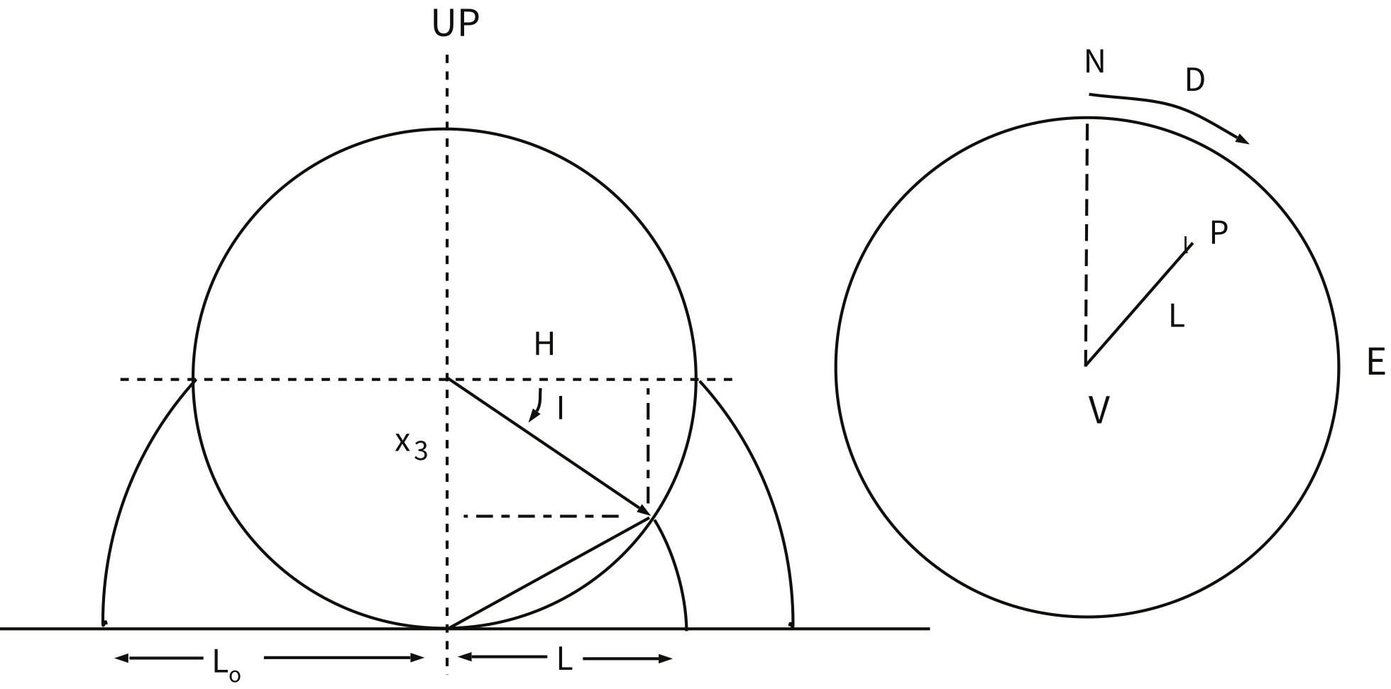
Figure B.1:Construction of an equal area projection for a point P corresponding to a of 40° and an of 35°. [Figure from Tauxe (1998).]
The principles for how to make an equal area projection are shown in Figure B.1. The point P corresponds to a of 40° and of 35°. is measured around the perimeter of the equal area net and is transformed as follows:
where .
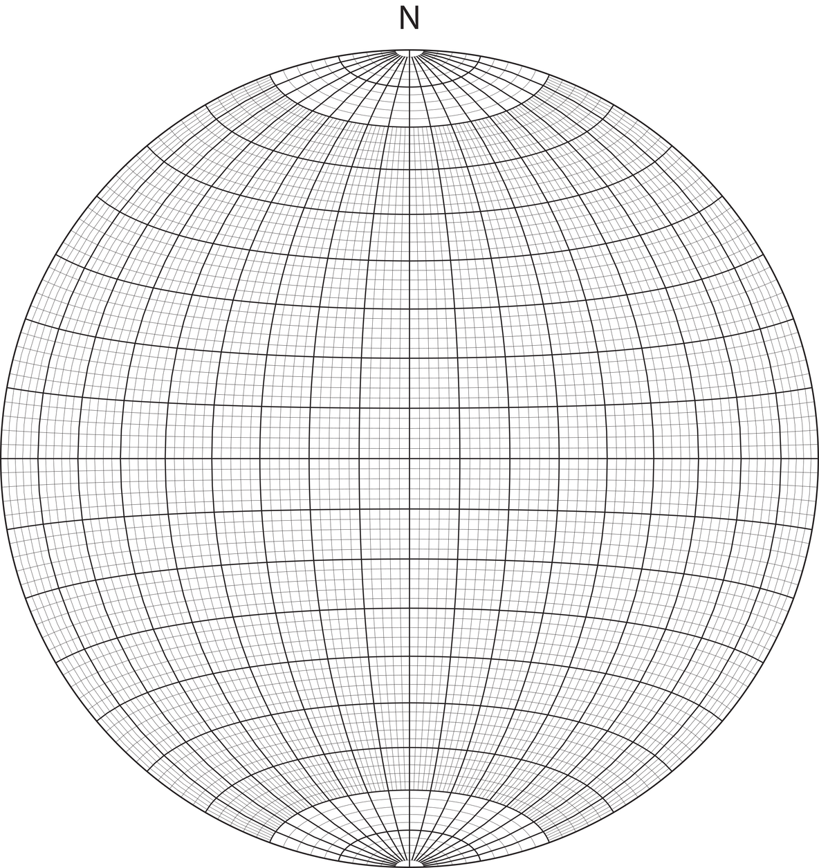
Figure B.2:Schmidt (equal area) net.
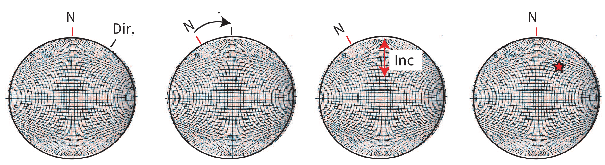
Figure B.3:How to use an equal area net (see text).
B.1.2Plotting directions
The principles for plotting directions on an equal area net are shown in Figure B.3. Print out the equal area net provided in Figure B.2. Then poke a thumbtack through the center of the diagram and place a piece of tracing paper over the thumbtack. Mark the top of the stereonet as N and the declination of the direction at in Figure B.3a. Then rotate the mark around the thumbtack such that the declination is at the top of the diagram (Figure B.3b). Count in from the outer ring the number of degrees equal to the inclination - the grid provided is in 2° intervals. Mark the direction (star in Figure B.3d). In paleomagnetism, the convention is for solid symbols to represent downward directions and open symbols to be up.
B.1.3Bedding-tilt corrections
Performing structural corrections can also be done with an equal area net. If samples have been collected from sites where strata have been tilted by tectonic disturbance, a bedding tilt correction is required to determine the NRM direction with respect to paleohorizontal. Structural attitude of beds at the collecting site (strike and dip, or dip angle and direction) must be determined during the course of field work.
The bedding-tilt correction is accomplished by rotating the NRM direction about the local strike axis by the amount of the dip of the beds. Several examples are shown in Figure B.4, and the reader is strongly encouraged to follow through these examples. An intuitive appreciation of these geometrical operations will prove invaluable in understanding many paleomagnetic techniques and applications.
Print out the equal-area grid provided in Figure B.2. Poke a thumb tack through the center and place a piece of tracing paper over it. The graphical procedure for the bedding-tilt correction is as follows:
Bedding attitude is defined by the down-dip direction (the dip direction) and dip angle. In the example of Figure B.4, the dip direction is 40° and dip angle is 20°. The azimuth of bedding strike (orthogonal to down-dip direction) is defined as 90° anti-clockwise from dip direction (310° in the example of Figure B.4).
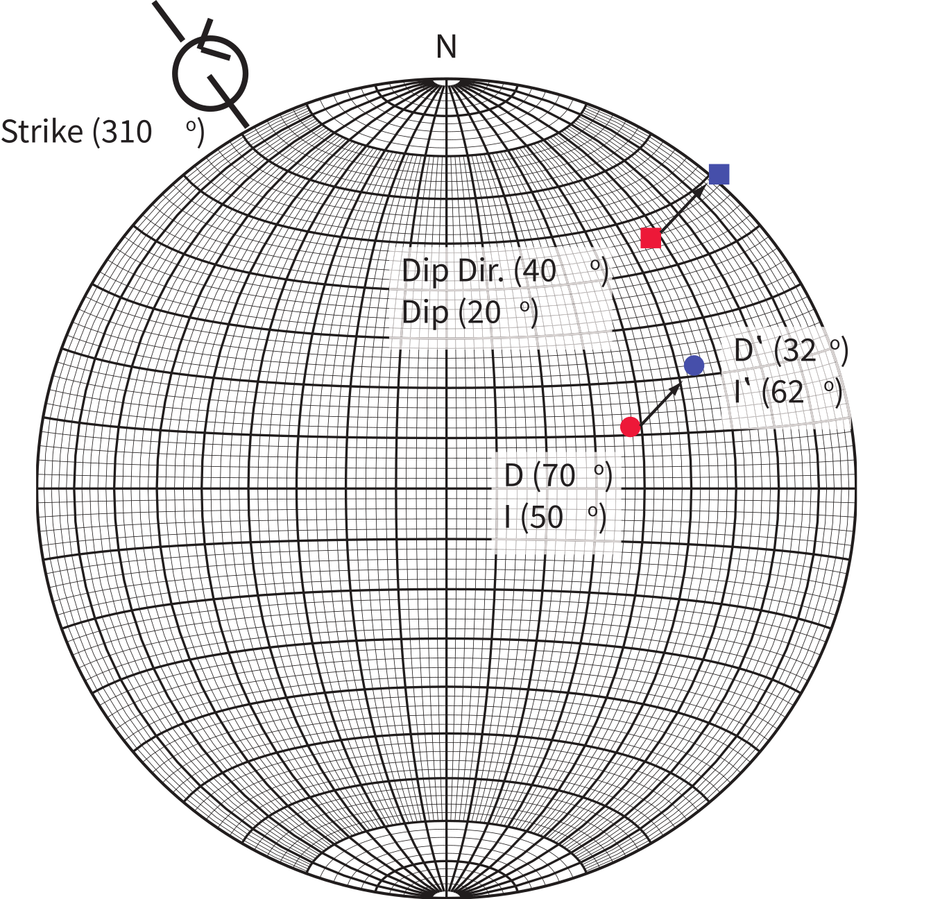
Figure B.4:Example of structural corrections to NRM directions. The bedding attitude is specified by dip and dip direction (squares on the equal-area projections); the azimuth of the strike is 90° anti-clockwise from the dip direction; the rotation required to restore the bedding to horizontal is clockwise (as viewed along the strike line) by the dip angle and is shown by the rotation symbol; the in situ NRM direction is at the tail of the arrow, and the structurally corrected NRM direction is at the head of the arrow.
Put the dip direction/dip angle and the paleomagnetic direction on the equal area net as described in Section B.1.2. These should look like the red square and circle respectively in Figure B.4. Now mark the strike direction as shown in Figure B.4. Rotate the equal-area grid such that the strike is at the top of the grid (you can also put it at the bottom or on either side).
The NRM direction is rotated clockwise about the strike azimuth (along a small circle) by an angle equaling the dip angle. In practice, this means that you count degrees from the circle toward the outer rim along the nearest small circle by the amount of the dip direction. If you reach the outer rim, just “walk back” in toward the center and keep counting. Plot a new circle (the blue one) at that point. If you reached the outer rim and continued back toward the center, this is a negative inclination (upward pointing) and you should use an open symbol.
Following this rotation, the in situ direction can be read from the equal-area projection. Rotate the blue dot to the up-down axis and make a mark on the outer rim. The degrees between this mark and the marked is the new declination. The number of degrees between the blue circle and the outer rim is the new inclination. For the example of Figure B.4, the in situ direction is = 50°, = 70° and the direction corrected for bedding tilt is = 32°; = 62°.
B.1.4Reading ternary diagrams
Ternary diagrams are triangles with the three corners representing a composition (e.g., A, B, C or Fe, FeO, FeO). In Figure B.5a we show only the A component. To get the percentage of this component, we count up from the base of the triangle and find that the star is 60% of the way toward the apex, indicating that the compound is 60% A in composition. The percentage of composition B is shown in Figure B.5b (15%) and similarly C is shown in Figure B.5c (25%).
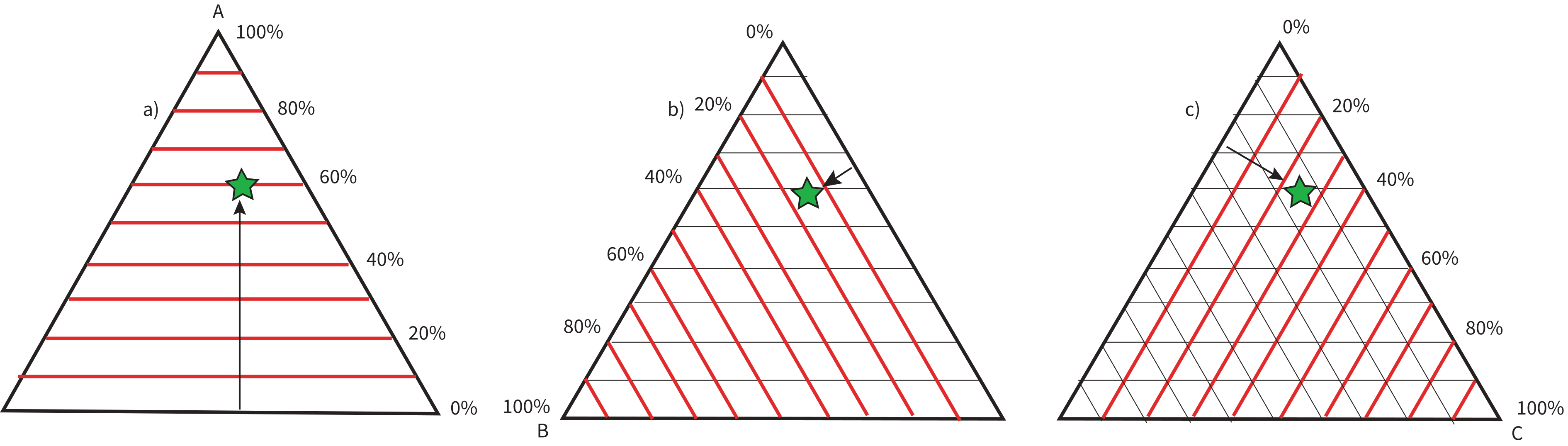
Figure B.5:How to read a ternary diagram. The three apices are components A, B, C. A composition is plotted as the star. a) Shows the percentage of component A (60%). b) Shows the percentage of component B (15%) and c) shows the percentage of component C (25%).
B.1.5Quantile-Quantile plots
When does a data set conform to a particular distribution? One way to assess this is through the use of Quantile-quantile, or Q-Q, plots (see Fisher et al. (1987) for a more complete discussion). In a Q-Q plot, data are graphed against the value expected from a particular distribution. The data are plotted against a value that is expected from the distribution; data compatible with the chosen distribution plot along a line. First, we will develop the Q-Q plot for the uniform and exponential functions required for a Fisher distribution. Then we will explain how to make a Q-Q plot for a normal distribution.
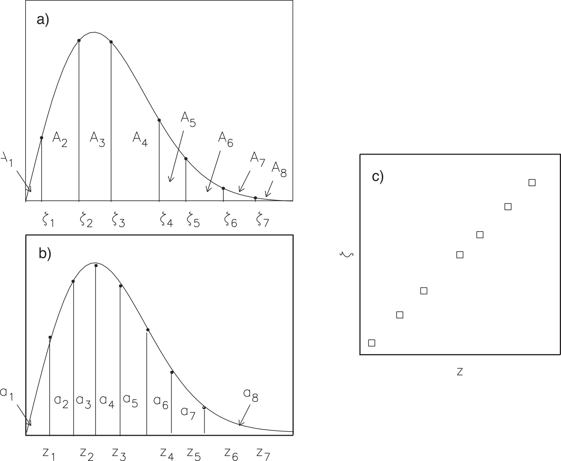
Figure B.6:a) Illustration of how the sorted data divide the density curve into areas with an average area of . b) The values of which divide the density function into equal areas . c) Q-Q plot of and . [Figure from Tauxe (1998).]
B.1.5.1Q-Q plots for Fisher distributions
In order to make Q-Q plot for Fisher distributions, we proceed as follows (Figure B.6):
Sort the variable of interest into ascending order so that is the smallest and is the largest.
If the data are represented by the underlying density function as in Figure B.6a, then the ’s divide the curve into areas, , the average value of which is . If we assume a form for the density function of , we can calculate numbers , that divide the theoretical distribution into areas each having an area (see Figure B.6b).
An approximate test for whether the data are fit by a given distribution is to plot the pairs of points (), as shown in Figure B.6c. If the assumed distribution is appropriate, the data will plot as a straight line.
The density function is the distribution function times the area, as mentioned before. The are calculated as follows:
so that:
and where is the inverse function to . If the data are uniformly distributed (and constrained to lie between 0 and 1), then both and . For an exponential distribution and .
Finally, we can calculate parameters and which, when compared to critical values, allow rejection of the hypotheses of uniform and exponential distributions, respectively. To do this, we first calculate:
and
For a uniform distribution , so is calculated by first calculating as the maximum of and as the maximum of . The Kuiper’s statistic is and is given by:
(see Fisher et al. (1987)). A value of can be grounds for rejecting the hypothesis of uniformity at the 95% level of certainty. Similarly, and can be calculated for the inclination data (using ) as and maximum of respectively. The Kolmogorov-Smirnov statistic is the largest of the two. The test statistic for exponentially distributed data is given by:
Values of larger than 1.094 allow rejection of the exponential hypothesis at the 95% level of confidence. If either or exceed the critical values, the hypothesis of a Fisher distribution can be rejected.
B.1.5.2Q-Q plots for normal distributions
In order to calculate the appropriate values for assuming a normal distribution (see Abramowitz & Stegun (1970)):
For , calculate .
If , then ; if , then .
Calculate the following for all :
and
where .
If , then ; if , then .
If , then .
The values of calculated in this way for a simulated Gaussian distribution are plotted as the “normal quantile” data and will plot along a line if the data are in fact normally distributed. To test this in a more quantitative way, we can calculate and as follows:
Calculate the mean and standard deviation for the data.
Then calculate:
and
Substitute into the following expression (function 7.1.26 from Abramowitz & Stegun (1970)):
where , and .
Change the sign of such that it has the same sign as .
Substitute into Equation B.4 and Equation B.5 in Section B.1.5 for and respectively. The Kolmogorov-Smirnov parameter (e.g., Fisher et al. (1987)) is the larger of or .
The null hypothesis that a given data set is normally distributed can be rejected at the 95% level of confidence if exceeds a critical value given by .
- Tauxe, L. (1998). Paleomagnetic Principles and Practice. Kluwer Academic Publishers.
- Fisher, N. I., Lewis, T., & Embleton, B. J. J. (1987). Statistical Analysis of Spherical Data. Cambridge University Press. 10.1017/CBO9780511623059
- Abramowitz, M., & Stegun, I. A. (Eds.). (1970). Handbook of Mathematical Functions with Formulas, Graphs, and Mathematical Tables (Vol. 55). National Bureau of Standards.